

OUR MEETING LAST WEEK
How not to be ignorant about the world - Hans and Ola Rosling
How much do you know about the world?
Hans Rosling, with his famous charts of global population, health and income data (and an extra-extra-long pointer), demonstrates that you have a high statistical chance of being quite wrong about what you think you know. Play along with his audience quiz — then, from Hans’ son Ola, learn 4 ways to quickly get less ignorant.
Watch at https://www.youtube.com/watch?v=Sm5xF-UYgdg
Hans Rosling described himself as an 'infotainer' and this presentation is indeed a most entertaining. He makes several valid points about where we ( the public) get our information and develop our pre-conceptions. He encourages us to take a more optimistic view of the world .
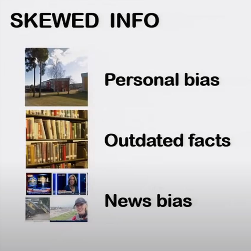
In many ways I agree with him and his son Ola. Our knowledge of the world is indeed, influenced by personal bias, outdated facts and news bias. I agree that most things are getting better for most of the world's population.
However, he also advocates that we should avoid ignorance by developing a 'rule of thumb' generally accepting ( among other things) only the most optimistic material material presented to us.
I am not alone in having to admit to a few reservations about the Rosling approach as well as his data & statistics .
. In his review if Hans Roslings book Factfulness, Christian Berggren, Prof. emer. Industrial Management, Linköping University, Sweden, wrote
When the authors of Factfulness compare t......, they seek to visually eliminate this gap. Without warning or explanation, they insert a logarithmic income scale in which each step reflects a tenfold increase over the previous level. This, they argue, provides a better idea of the reality behind the numbers and triumphantly exclaim: “Now the gap has almost disappeared.” However, this effect is trivial when a log scale replaces a conventional scale. The trick is reminiscent of the saying about three kinds of lies: lies, cursed lies, and statistics. The true difference between Americans’ $67/day and Mexicans’ $11/day remains, of course. The authors’ selection of indicators and efforts to obfuscate contradictory evidence reduce the credibility of the book and its important positive statistics.
I express my own concerns because I strongly believe that when advising the public in general that the information they receive is is tainted, it is important to be clear and accurate about the material one presents to counteract the tainted material.
A couple of my own observations re misleading presentation of data:
- With regard to his graph re global poverty, he does indeed advise that he has made further projections on World Bank projections on growth, using the same rate of growth. Unfortunately, he does not reveal or perhaps take into consideration the implications of the multiple assumptions contained , (a) within the original World Bank projections and (b) within his own further projections.
- Another example : his graph of global deaths from natural disasters is clearly inaccurate.
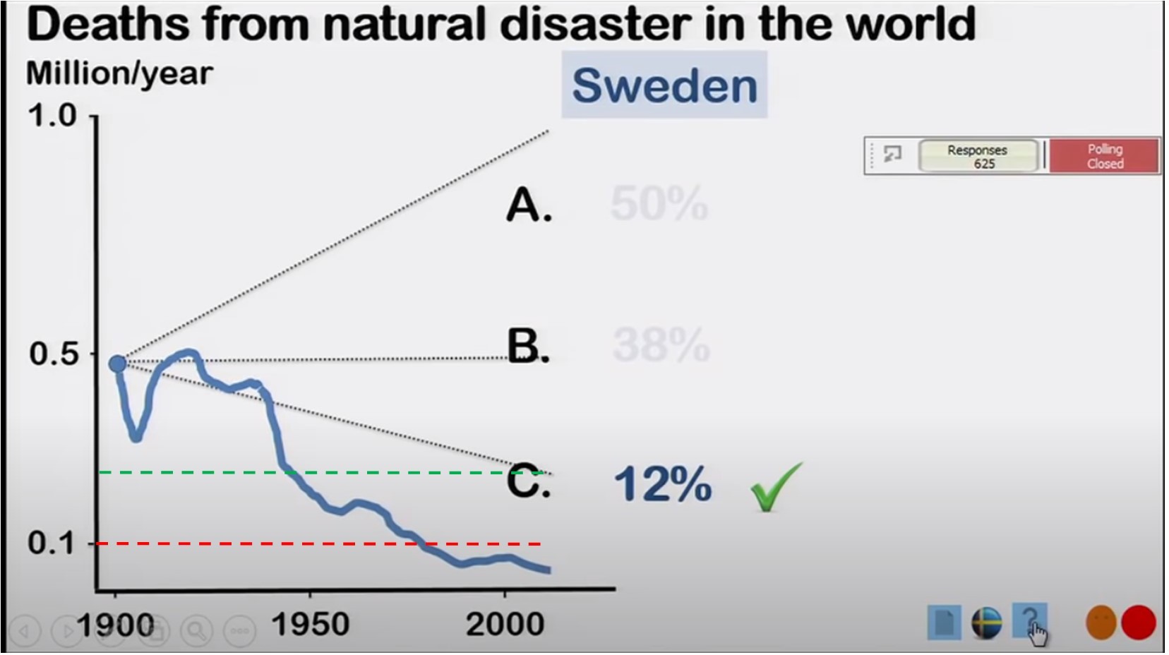
I have on the right a screen shot of the graph he used representing worldwide deaths from natural disasters and
I have added for ease of referencing
- a dotted red line to represent 100,00 deaths (on the vertical axis)
- and the dotted green line to estimate slightly fewer than 250,000 deaths
This video presentation was made in 2014, and the dates on the horizontal axis represent a period in 50 year intervals, from 1900 to somewhere I would estimate at around 2010 or later ( from measurements)- certainly beyond 2004.
My Observations:
- The horizontal red dotted line which I placed for ease of reference/perspective clearly shows that, according to this graph, there has not been as many as 100,000 deaths from natural disasters since the year 2000.
- The Boxing Day Tsunami took place in 2004. The death toll for that disaster alone is known to be between 225,000 and 230,000,( some estimates place it as high as 275,000.)
- Even if that were the only natural disaster in 2004, the graph should show a spike to at least the green dotted line I placed ( also for perspective).
If the death toll from the Boxing Day tsunami was left off this graph, one must question what other natural disasters are not represented in the graph.
How accurate was the information provided?