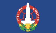
 Today we heard from Ed Mejia who designed the new City of Lincoln flag. The original City of Lincoln flag was designed in 1932. Ed told us about the meaning of the new flag. This all started in 2019 when Kyle Wilson was talking about the original flag and they were looking for a new design.
There are specifications required for designing the flag. All designs must adhere to the North American Vexillological Association’s (NAVA) five basic principles of flag design:
• Keep It Simple. The flag should be so simple that a child can draw it from memory.
• Use Meaningful Symbolism. The flag’s images, colors, or patterns should relate to what it symbolizes.
• Use 2 or 3 Basic Colors. Limit the number of colors on the flag to three. These colors should contrast well and come from the standard color set used by nearly all flags adhering to these principles.
• No Lettering or Seals. Never use writing of any kind or an organization’s seal.
• Be Distinctive or Be Related. Avoid duplicating other flags. If you do use elements similar to another flag, make sure there’s a reason for it.
WHAT WERE THE MUST-HAVES TO REPRESENT LINCOLN?
The theme had to show what best represented Lincoln. Some of the themes that were:
To reflect Lincoln as a welcoming city, home to many refugees and immigrants. Reflect the high quality of life enjoyed by Lincoln residents, particularly the balance between work and life, the feeling of being in a big city and a small town. It could reflect our desire for being responsible, sustainable growth that won’t compromise our character and identity. It had to celebrate Lincoln’s exceptional public parks and trails system. It needed to reflect Lincoln’s identify as a hub of innovation and technology – Silicon Prairie. It needed to reflect Lincoln’s educational values, public school district, and higher education institutions.
All Roads Lead to Lincoln

Inspired by the art deco architecture and native peoples’ artwork displayed inside the capitol building, this flag uses simple lines to convey Lincoln’s past and it’s future by alluding to the interconnection of technology, agriculture and commerce. Whether you’re a life-long Lincolnite or recent refugee in our town, there is hope and optimism here. These values are visually represented by the radiating, concentric artwork symbolizing a “beacon” or safe harbor for those looking to better their lives. Some of the recognizable imagery implied by the lines are: the state capitol building, a sunset, and an aerial view of the traditional center of town (13th and O Street), and a well to represent our state’s agricultural heritage. The colors are based on the Nebraska state flag. The yellow was modified to look closer to gold and the blue was shifted to teal by adding a green hue as a tip of the hat to the verdant tapestry in Lincoln which is home of The Arbor Day Foundation and many City parks.
There were no tax dollars used for the design of the new flag. There several sponsors for this contest and over 200 designs were submitted. If you look at the New Mexico flag you will see some familiarities to our new City of Lincoln flag. Ed asked how many of us have seen the “star” in the middle of 13th& O Street, which is the center of Lincoln. No many. His flag has a star in the middle, which represents the Center of Lincoln (13th & O Street).
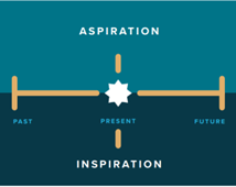
In the design is bit of the art work from the State Capitol, a bit of the aquifer which represents water and a little bit of the root system which represents agriculture. The flag itself has a timeline as you can see.
What does it mean to you?
Legacy of Love, Artists, Storytellers, Kind People, and Lincoln-born and raised. I am sure that we can also come up with other words to describe what it means to anyone of us.