4 Reasons Why Now is the Right Time for Rotary to Rebrand
by John Borst, Communications Director District 5550
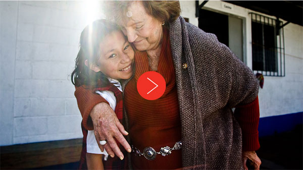
Why We Did It – Video
How does any organization know when to ask the big questions about itself and along with it, in this the era of consumerism, ask the big question about its brand identity at the same time?
In the case of Rotary International it was becoming clear that it met four of the classic qualifications that prompt many for-profit and not-for-profit companies to rebrand. What are these conditions; how did Rotary exemplify them and how did Siegel+Gale respond?
1. You’re transforming yourself.
Up until about 2000 the Rotary brand was for all intents and purposes local. Even though by that time, it was organizationally International, its clubs acted almost exclusively at the community level. Rather unwittingly, Rotary actually began the shift to an International brand when it created the Health, Hunger and Humanity (3-H) Grants in 1978 and shortly thereafter decided to eradicate polio from this world. Within Rotary, one result was the separation of The Rotary Foundation into the Annual Programs Fund and The PolioPlus fund. Post 2000, with the growth of the Internet and social media the Humanity in Motion series expanded Rotary’s brand as internationally focused, as a voice for peace, clean water, and “saving mothers and children”. Its message was “Doing Good in the World”. This was made even more concrete in The Foundation’s Future Vision Plan with its Six Areas of Focus.
During all these changes Rotary’s branding remained constant, the two color iconic wheel designed in 1926. But as Alfred Muccino CCO, at Liquid Agency has written “Rebranding serves as a symbol that the company is evolving and growing, seizing the opportunity to energize the brand for both external and internal audiences.” By 2013 Rotary and its brand were out of sync.
2. You’re branching out into new markets.
Rotarians are very secure in how to put “Service Above Self” in working to better the community within which they work, live and play but they have also learned through the Polioplus experience that they can accomplish even more on a global scale if they work with other global partners. The development of a new branding identity for Rotary is sending a signal to the marketplace of future partners, members and donors that Rotary is leveraging its leadership and experience as a global force for good and offering new solutions in broader areas.
3. You’re striving to diversify your audience.
At the heart of Rotary are its 1.2 million members. Traditionally these members have been well educated entrepreneurial businessmen but at nearly the same time as it took on the challenge of eradicating the polio virus, it diversified its membership and accepted women. Although Rotary has a long way to go to achieve genuine parity by gender the greater problem is a disparity in age. The past three decades have seen the emergence of Generations X and Y and now the Millennials. In business speak these are our new customers.
As the eradication of polio has demonstrated solving global problems is a multi-generational problem and the majority of today’s Rotarians are not going to be around to eradicate illiteracy or ensure material health for all mothers or clean water for humanity. To paraphrase Muccino “Since (Rotary) seeks to build awareness and influence with these new ‘customers’, the brand identity needed to evolve and take into account the expectations and aspirations of (this) sophisticated audience segment.”
4. Your growing up and evolving with the times.
 “Rare are the brand identities that can sustain the passage of time without being modernized to reflect contemporary aesthetics.” (Muccino) Just look at the evolution of Pepsi Cola above.
To this end, entered Siegel + Gale the global strategic branding firm. Despite its numerous promotional efforts Rotary had not fully rebranded itself since 1926. Clearly, the Rotary wheel was looking dated. So on September 19, 2013 Rotary and Siegel + Gale rolled out Rotary’s new branding “to enhance and amplify the volunteer service organization’s great story, visual identity and digital experience.”

In their announcement they make it very clear that “…Rotary creates—community impact scaled globally.” They “clearly signaled they wanted to show “how both members and non-members can engage with Rotary” and they wanted to “tackle the organization’s digital experience…with a responsive design approach that provides an optimal experience across platforms—from desktop to mobile.”
So as Maccino says above, the one condition that justifies a new identity is simply being able to keep up with current aesthetic standards and this is what Rotary with Siegel + Gale’s help has done.


Download the website sponsorship guide